Hypercritical
Front and Center
By the time Mac OS X was first released in 2001, I had been using what would eventually be known as “classic” Mac OS for seventeen years. These were seventeen formative years for me, from the ages of 9 to 26. The user interface of classic Mac OS was as ingrained in me as Star Wars or any other cultural institution.
My love for classic Mac OS is why I started researching and reviewing Mac OS X. Big changes were coming to the Mac, and I was going to feel them more than most. I needed to know what I was in for.
To deal with some of the changes in Mac OS X, I ran apps and system extensions that restored some behaviors from classic Mac OS. Over the years, I weaned myself off most of these, but a few stuck. In particular, I found I did not want to live without the window layering policy from classic Mac OS.
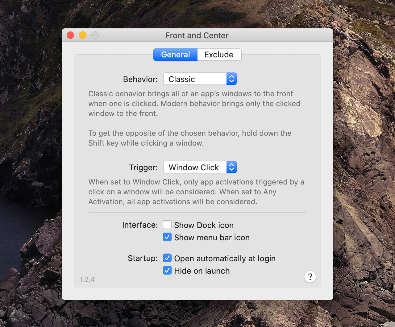
In classic, when you click on a window that belongs to an application that’s not currently active, all the windows that belong to that application come to the front. In Mac OS X (and macOS), only the window that you click comes to the front.
My particular style of window management leans heavily on the classic behavior. I also appreciate the Mac OS X behavior in certain circumstances, so I was delighted to find apps that enable both behaviors, using Shift-click to override the default.
Sadly, macOS Catalina’s lack of support for 32-bit apps finally killed the last of the apps that implemented this feature. I was alone in a cold, barren world where I had to click on a Dock icon to switch to an app and bring all its windows to the front.
I tried to get used to it, but I could not. Next, I tried to persuade a few of my developer friends to create a tiny Mac app that implements just this one feature. My friend Lee, a longtime Mac developer and user, eventually took up the challenge and created a simple app to do it.
It was missing a few features I wanted (the Shift-click override, the ability to hide the Dock icon, a menu bar icon, etc.), but Lee shared the source code with me and I dove in and tried to help. I added the Shift-click feature and a mode-switch preference. I drew an app icon and a menu bar icon. The app was just about done. It even had a name: Front and Center.
The app was written in Objective-C. I’d always wanted to do a real project in Swift, so I started a new project in Xcode and rewrote the entire (tiny) app in Swift. I’ve also always wanted to get some experience with the App Store, so Lee and I agreed that I would release it under my developer account (though we are sharing the profits).
Front and Center is a trivial app—so trivial that I was afraid it would be rejected for its limited functionality. But when running, it is used literally hundreds of times a day. And I obviously found it so essential that I was willing to help bring it into existence myself. I also wanted to get some experience with the financial side of the App Store.
All of this contributed to the decision to make Front and Center a (cheap) paid app. It’s $4.99 on the Mac App Store. I don’t expect to make any significant money from sales, but I’ve already gained a huge amount of experience just going through the process of development and distribution.
I also view the price as a kind of deterrent. The increase in downloads it would receive as a free app would just be an unwanted support burden. The (few) people who actually want this app know who they are, and I’m betting they are not just willing but happy to pay for it.
Are you a classic Mac diehard who still misses some of the old ways? Or maybe you just want to try it to see what it’s like? Even if you don’t want the classic behavior to be the default, you can switch to “modern” mode and use Shift-click to trigger the “classic” behavior. It beats mousing down to a Dock icon, right?
I’m just glad this app exists. I had a ton of fun working on it. Thanks to Lee for being a kindred spirit when it comes to classic Mac OS, and to all my other Mac-nerd friends who offered advice and code during development—especially Gus Mueller, maker of many fine Mac apps, who provided a surprising performance enhancement for our tiny app. I’m excited to finally be able to use this badge on my website.
