Hypercritical
Waiting for the handheld revolution
It’s not a question of where he grips it.
Behold, the first great console game pad:
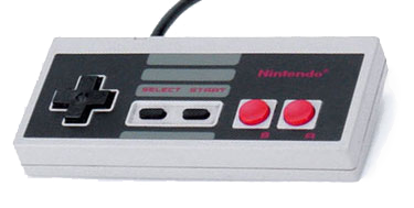
It was a rectangular solid with the sharp edges slightly knocked down, as if by fine sandpaper. It had one cross-shaped directional pad, two game-play buttons, start, and select. And we liked it, because it was all we had!
In a few years, it evolved into this:
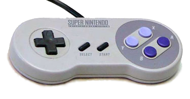
It really was super: more face buttons, some crazy new “shoulder” buttons, and would you look at that? Rounded sides! An ergonomic wonder, truly. Where could Nintendo possibly go from here?
Ask and ye shall receive. For their next trick, the magicians at Nintendo rethought the entire “candy bar with buttons on it” paradigm and produced this beast.
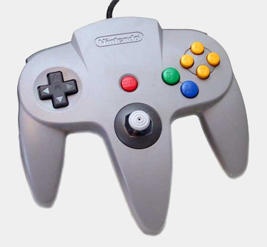
Unpleasant to look at, perhaps, but it absolutely disappeared five minutes into Super Mario 64. Realization number one: the negative space created by a human hand gripping something is ugly. Realization number two: controllers designed to fit in this shape kick ass.
Most recently, the digital pad has been further marginalized (sorry fighting game fans) and the shape has been refined. (Also, Best Analog Stick Evar. Super Monkey Ball doesn’t lie.)
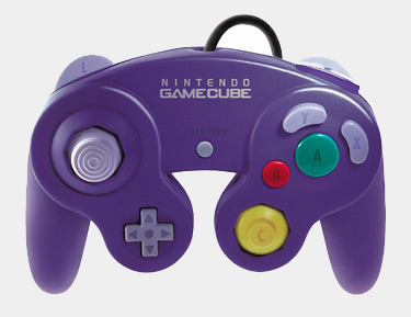
The GameCube controller was an evolution rather than a revolution, to be sure. When it comes to controllers, NES is to SNES as N64 is to GameCube. (That’s SAT gold right there.) Still, we’ve come a long way in two decades.
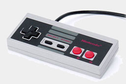 |
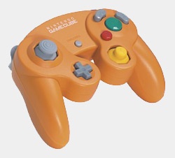 |
| from this… | …to this |
From an industrial-looking monolith to an organic blob. Progress? I think so. Holding on to that NES block-with-buttons is a young man’s game. After twenty years of Unix, IRC, ICQ, AIM, and countless lines of code, my hands don’t recover from abuse as fast as they used to. And why should a controller inflict abuse at all? Give me the GameCube controller any day, thanks.
Now let’s rewind and take look at handheld gaming. Here, the controller is the device, and vice versa. Things start off, predictably enough, with some rectangular solids. First big, then smaller and in color. (Images not to scale, sorry.)
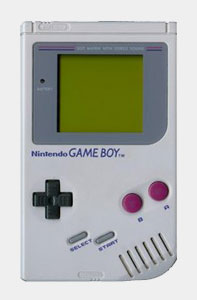 |
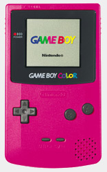 |
This design lasted a long, long time—much longer than the generational siblings in the console world. Then came the Game Boy Advance and its more refined offspring, the Game Boy Advance SP.
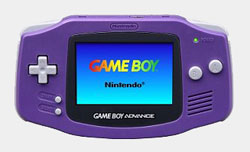 |
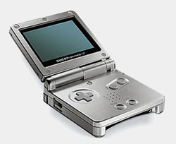 |
Er…huh. More rectangular solids. No paradigm shift in sight. In fact, the SP looks like it’s regressing. No guesswork is needed, really; they come right out and say it.
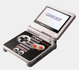 |
 |
Fair enough; I can wait. What’s next?
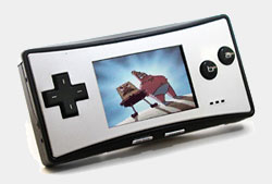 |
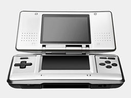 |
Okay, a really tiny candy bar containing an entire system, and…wait, what’s this? Two screens and a pen? They broke the mold! They—…hm, wait a second. That thing’s still rectangle with buttons on it. I’m starting to lose faith here…
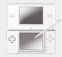
Fine, whatever. A tiny iBook. Great job. Look, I understand the whole portability angle. I get it. No one’s going to slip a GameCube controller into a jacket pocket. And I really do appreciate the Apple homage with the DS Lite. It looks great (and I’m sure it’s ten times as sturdy as any product Apple currently ships).
But let’s take a step back. These are handheld game machines. You hold them in your hand. How many years will it take before someone realizes that sharp-edged rectangular solids are not ideal for gripping? Again, I recognize the constraints here. All I ask is some sort of acknowledgment of the reality of “hands”—some sort of progress.
Symmetry and geometric purity are great. But please, not for the part that I grip. I don’t have a Master Plan for ergonomic handheld gaming (although I suspect it involves “folding” of some kind), but there’s no need for one. I will accept fits and starts. I will endure blind alleys. I’m willing to put up with quite a lot, actually, if I feel like someone, somewhere is thinking about how their device will fit into my hands. Nintendo’s console guys sure as hell are, but the portable team still seems fixated on my pocket, or maybe an aftermarket protective case.
Think hands, people. It’s all about the hands.
This article originally appeared at Ars Technica. It is reproduced here with permission.