Hypercritical
Poor pickers proliferate
The Dashboard widget picker stinks. You can see it in action at Apple’s web site. It’s the little gray area at the bottom of the screen that contains a row of draggable widget icons. When the list of available widgets no longer fits in the width of your screen, tiny arrows appear on either end of the list. Hovering over one of these arrows causes it to expand into a larger button-like graphic that partially covers the left- or right-most widget icon. If you accidentally mouse-over the arrow when aiming for the widget, you have to carefully click “around” the newly expanded arrow graphic in order to hit your original target.
That’s pretty annoying, but it’s small peanuts compared to the biggest sin of this interface element. If you want to browse through the list of widgets, your mouse has to travel all the way from one side of the screen to the other each time you change direction. Your target after each trip is a tiny 16-pixel-diameter circle. Here’s a demonstration of this aspect of the interface. (Sorry for the pop-up window. I would have embedded this movie in the page, but apparently the Ars journal system doesn’t allow that.)
Yeah, cmd-left/right arrow will scroll the list too, but how many people have discovered that shortcut? Either way, it doesn’t change the quality of the mouse-based interface. It’s extremely user-hostile. This, combined with the small, low-contrast text and the sometimes not-so-descriptive icons, makes quickly finding and launching a new widget a very unpleasant experience for me.
So, how can this be fixed? If only there were some way to efficiently browse and select from a list of items that’s too large to fit within a given container…some sort of “scrolling” device, perhaps. Hey, I know! How about a friggin' scrollbar?
A standard proportional scollbar provides a large click target, in the form of the “scroll thumb” or "scroller", for lists of items that are not fantastically longer than their containers (Dashboard widgets easily qualify), and this target can be dragged in both directions during a single operation. The Dashboard widget picker is essentially a broken scrollbar. It’s a scrollbar without the scroll thumb, and with unidirectional arrows that overlap the content area placed on opposite ends of the container.
The best scrolling views also support some sort of type-ahead feature (e.g., type the first few letters of an item and it becomes selected; hit tab to advance alphabetically; hit shift-tab to go in the opposite direction). The Dashboard widget picker has none of these features.
Then there’s the meta-issue of whether constraining the widget list to a single row is such a hot idea to begin with. While it would be a bad idea to obscure too much of the screen with rows upon rows of widgets, the user should be in charge of this decision. Simply giving the widget picker area a vertical resize handle would go a long way towards making owners of the 30-inch Apple Cinema HD Display feel less like killing themselves as they mouse from one end of their giant screens to the other while trying to find a widget in a list that would fit comfortably on their screens if only the picker contained two rows of widgets instead of just one.
But fine, whatever. Apple’s adds some crazy widget or another in each OS X release, it seems. Yeah, it’s depressing, but there’s no sense dwelling too much on what you can’t change. So why am I writing about this at all? I felt like I had to say something…because it’s spreading. Take a look at this picture of the theme picker in Sandvox.
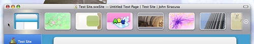
Stop the madness!
Here’s a video if it in action. Okay, so the slanting icons are cute (although I think they slant in the wrong direction), but the let’s not lose sight of the big picture here! The “demo effect” wears off after about two minutes of scrolling. Then you’re left with potentially years of trying to actually use the damn thing to browse and select items from the list.
Apple’s probably a lost cause, but I hope third-party Mac developers will listen to reason. Please don’t make interfaces like this. There’s a reason scrollbars are so ubiquitous. If you really think you can come up with something better, then go for it. But rest assured, this ain’t it. Just Say No to magical scrolling regions without scrollbars. Your users will thank you for it.
This article originally appeared at Ars Technica. It is reproduced here with permission.